The steps taken to create Great Ten #3 Page 15!

I really enjoyed working on this page, and I thought it would make a good example to share all the steps taken to create it!

I have found that this 4-step process works very well for me. I compare it to sculpting: I start with the most general, overall shapes and sizes, and progressively refine the detail in stages to arrive at the final image.

All the energy and work involved in each step is not wasted. Quite the contrary. By working on a lightbox, each step taken becomes the foundation for the next step. Nothing is wasted!

I also thought it helpful (for all those aspiring artists out there!) to show the relative sizes of each of the steps. Each comic page I create follows these same 4 steps - and each comic page I create begins with very small thumbnails!

Let's get started!


Starting place: Script
STARTING PLACE: SCRIPT

Every page starts with a script! After all, the comic book artist is first and foremost a storyteller, so it is only proper to begin with the story!

We've all read a novel. When we become engrossed in the story, we lose track of the mechanical process of reading (eyes moving left-to-right, top-to-bottom) and images begin to take shape in our minds. Descriptive and clear text inspires sharp and clear pictures in our minds. In simple terms, that is the job of the comic book artist: to read the script, allow those images to form in our mind's eye, then scramble to get them down onto paper for further analysis and refinement.

Presented for your review is the script for this story page written by the excellent writer Tony Bedard. Read it over a few times, to make sure you understand the action occurring here.

Try to get a picture in your mind of the action occurring on this page, as if you are standing amidst the action.

Just a few notes on my markings:

  • The boxed number in the upper left corner. That is simply the number of panels on the page. It helps to understand the density of images required by the page.
  • A common practice for me is to write notes or sketch little images all over the script - and often each story page will have numerous notes in the margins! Whether a question, an inspiration for an idea, a clarification, etc., these notes are meant to sharpen my understanding of the story or immediate "initial reactions" to story points that should influence the art. However, on this particular page, everything was crystal clear for me, as this page is just one of several in an ongoing fight sequence.
  • I'll use Pink/Purple highlights to indicate REFERENCE items that need to be researched.
  • I'll use Orange highlights to indicate DESIGN items.
  • I'll use Yellow highlights to indicate page composition information (like a notation that an image is a SPLASH, or a panel is an INSET, etc.)
  • I'll use Green highlights to tag text that is to be integrated in the lineart (like text on a TV screen, or specific markings/signage on a building).

Normally, I read the entire script several times (at least 3 times) to make sure I understand the entire story, and to identify any opportunities to try something visually creative (implement visual themes, mirrors, etc.).

Furthermore, I usually do the bulk of the reference research and design work for the entire issue before drawing the first line! Each piece of missing reference or incomplete design creates a "gap" in the information needed to properly tell the given story. I find that I work better if I close as many gaps as practical before drawing that first line.

So onto what I'll call STEP 0 - the design work and reference gathering effort!


STEP 0 - DESIGN AND REFERENCE

Every page requires some level of design and reference. As the story unfolds, new characters and objects and locations are constantly presented, and the artist must be able to manage all these visual requirements.

In fact, I spent more than 1 full week just acquiring photographic reference and figuring out a map of the action the characters take through Beijing!


Kuan Ti
DESIGN

Each story will feature never-before-seen objects or characters, and it is the penciller's job to create the visual for these objects. While the design work for Kuan Ti was done as part of the effort for issue #1 (recall he first appeared on # 1 page 21), at left is the design model sheet I prepared for him. As you can see, I am a Photoshop novice, but I know enough to get my ideas communicated to the colorist!


Beijing
Central Business District
Map


Beijing
Central Business District
City Planning Model


Story Map


CCTV Building

CCTV Building

China World Trade Center

The Place Mall
REFERENCE

Each story will feature real objects or locations that need to be portrayed accurately, and the artist must arm himself with sufficient photographic reference to enable articulation of those objects or locations. This story presented a very formidable challenge - the action took place in Beijing's Central Business District, at the foot of the CCTV (Chinese Central TV) Building.

Writer Tony Bedard wanted the main fight sequence to occur at the CCTV Building, but the rest of the blocking was up to me! In order to knowledgeably plan the action in the city, I first had to learn the 'lay of the land' inside Beijing.

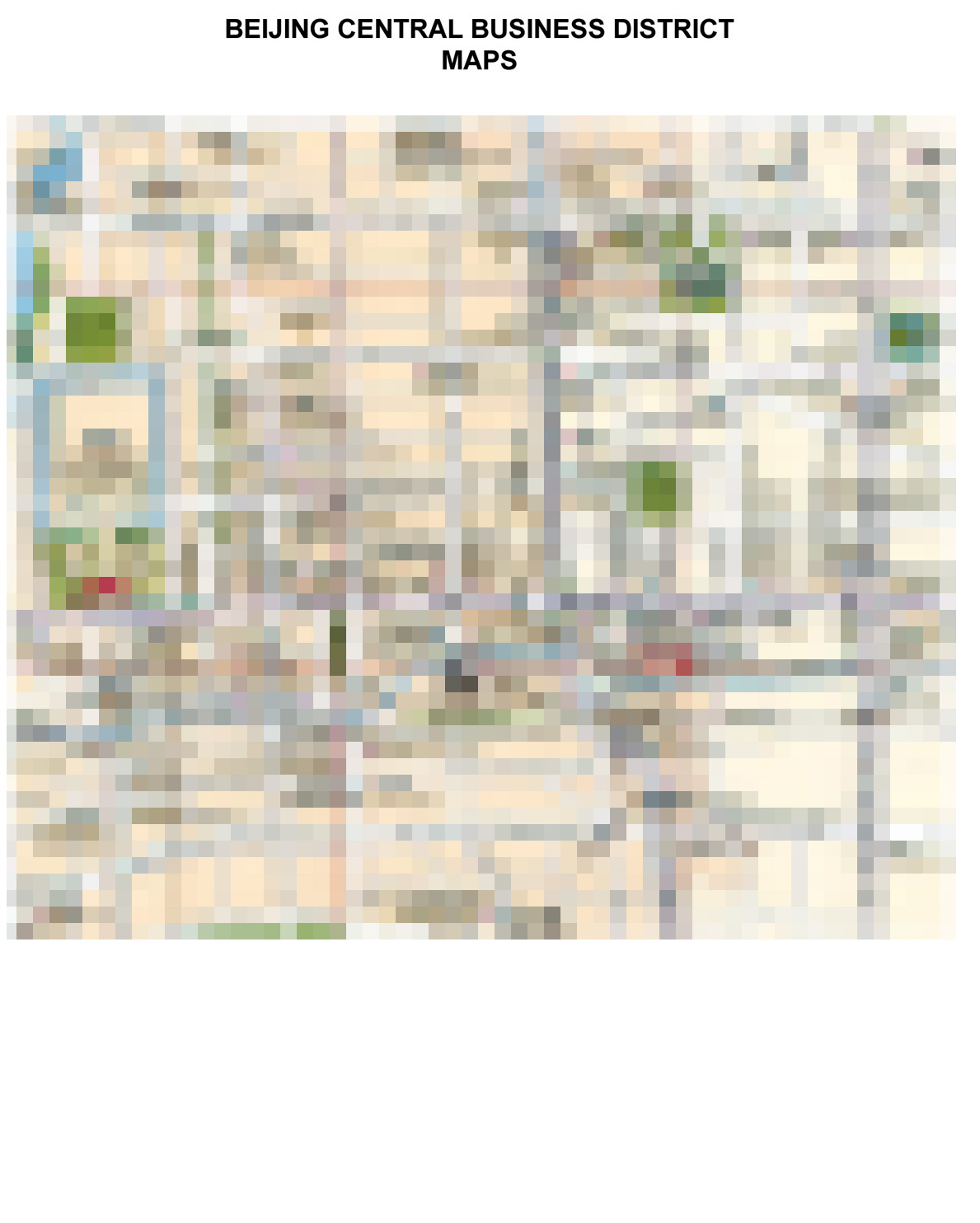
This is no easy task! Beijing is the capitol city and the second largest city (behind Shanghai) in mainland China. I started collecting maps of Beijing that focused on the area of the city that housed the CCTV (Chinese Central TV) building, the major set piece for this story. That area is the Central Business District.

Armed with simple street maps, I dug up maps that featured bilingual building callouts that specifically identified buildings around the CCTV Bldg. Once I knew a building's name, finding reference on it was much easier! One of many such street maps with building callouts is shown at left (Beijing Central Business District Map).

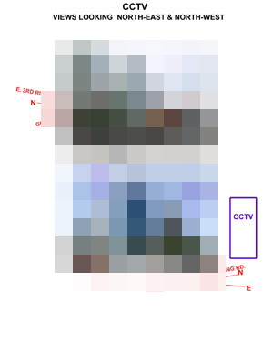
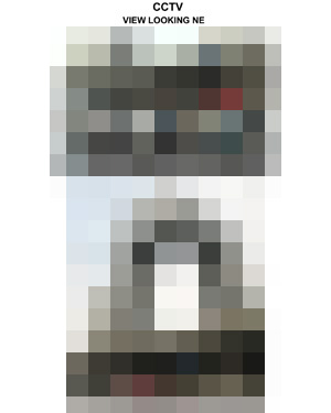
Next, I needed to put this 2D map representation of Beijing into a 3D context. A valuable tool I discovered for this task are Urban Planning Models. Many large cities build scale models for urban planning purposes. They proved to be incredibly valuable visual aids to really understand the layout of the city. Satellite imagery, while also useful, compresses the vertical scale and often provides distorted, ground-cluttered views, while a city planning model provides clear, natural 3D views of the city. I placed street names, building names and the compass to create my own "user-guide" to this section of Beijing (see the image at left 'Beijing Central Business District City Planning Model')!

The only shortcoming of the urban planning model is the lack of realistic surface detail (like brickwork, glass facades, storefronts, street-level detail like lamps and planters, etc.), but that surface information can likely be found through collecting photographs using creative internet searches.

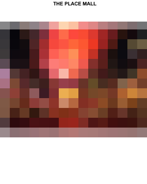
During my research of Beijing, I found a location called The Place Mall, known for having the world's largest LED screen. The Mall was close enough to logistically fit within this story, so I chose it as the opening location (you'll see it on pages 2 and 3!).

In fact, I mapped out the character's journey from the Place Mall to the CCTV building on an image at left (STORY_MAP). The little numbers inside the red circles indicate the location of the characters ZOU and WU on that specific page of the story!

This was a LOT of work - but I think it served the story well, to accurately place the action within this real city. A reader who is familiar with Beijing will instantly recognize the buildings, and appreciate the effort taken to accurately render the city.

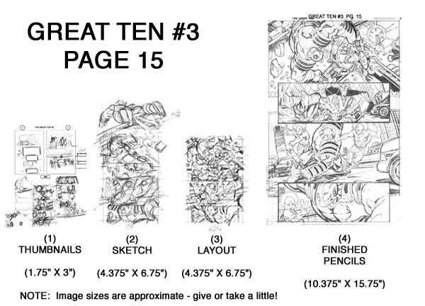
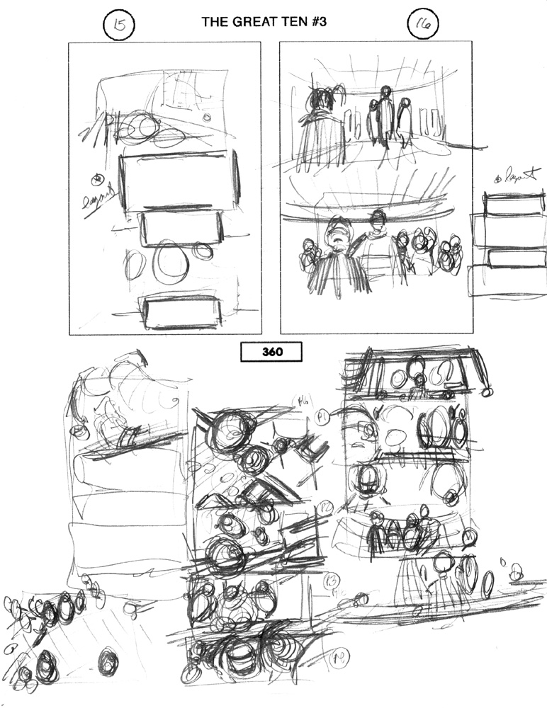
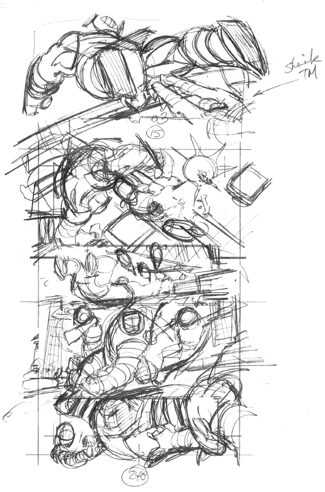
For issue #3 I created 101 reference sheets like the ones shown here!


Step 1 - thumbnail sketches
STEP 1 - THUMBNAILS

NOTE:

I find I work more efficiently if I work in batches of pages, and I usually go through the following steps working on a group of 5 to 11 pages at a time. Recall that the script study allows you to see the entire story and create visual ideas that apply to pages anywhere in the story, but here is where you begin to implement those strategies in a methodological way. Working in batches is very helpful for several reasons:

  • It allows you to get your "head" into the stage at hand, to think effectively on the challenges each story page presents.
  • It allows you to complete pages in small groups which can go to the inker while you continue working on the next batch of pencils (which is excellent for the schedule).
  • Once you complete a sufficient number of pages, the process of getting paid for those pages can begin (the trusty old 'cash-flow!').

Every single page I create begins as a set of small thumbnail sketches!

The point of the thumbnail image is to capture the large-scale information of the page:

  • Overall page composition (eye flow across the panels)
  • Selection of camera angles

That's it! Don't focus on the actual object details at this point - only on the ELEMENT PLACEMENTS and the RELATIONSHIPS BETWEEN ELEMENTS.

You can see I worked a variety of thumbnails here! Sometimes I "see" the written page clearly and I have a pretty solid idea of how I'd like the page to be designed with one good thumbnail. However, there are plenty of other times when I "see" a blizzard of competing ideas that have to be somehow distilled and analyzed. The thumbnail sketch is a very quick way to test / examine ideas to find the ones that work and the ones that don't. And this is one of those pages that offered a lot of options and ideas that had to be considered!

I always begin page composition by trying to identify the strongest, most dramatic moment that occurs on the page. If one moment seems strongest, it becomes the dominant image on the page and all other images become subservient to it. Upon studying this page, I determined that it actually had a steady beat of action, and that no one particular action was dominant; in other words, all the action here was of nearly equal importance.

For situations like this (all panels on the page being more or less equal in importance), I tend to use a symmetrical or evenly spaced arrangement to visually reinforce it's evenness.

I began the thumbnails in the lower left corner, and worked counter-clockwise as I sketched out all the competing ideas. The last thumbnail is on top (inside the box). It was here that I noticed a small pattern on the page.

While working the thumbnails, I noticed a subtle pulse could be coaxed from the action. Panels 1 & 3 featured striking / offensive actions, and panels 2 & 4 featured the effects / defensive actions. I decided to slightly enhance panels 1 & 3 and slightly reduce panels 2 & 4, while maintaining the overall regularity of the page design. This way, the panels ebb and flow subtly like a pulse, which brings more energy to the page.


Step 2 - sketch
STEP 2 - SKETCH

Once the thumbnail composition is chosen, it is enlarged to the size shown above (which is nearly the size of the printed comic) and it becomes the foundation for this next stage - the sketch stage.

The point of the sketch stage is to begin to develop the structural detail underlying the simplistic thumbnail drawing:

  • Capture the energy of fluid gestures and motions (of both objects and locations)
  • Rough in the perspective required to implement the shot
  • Develop the figures as cylinder bodies, capturing body language gestures, body line, figure balance and relative sizes throughout the shot
  • Accommodate sufficient space for all text (dialogue, captions and sound effects) required in each shot
  • Manage the proper flow of text WHILE maintaining proper storytelling rules.

At this stage the RELATIONSHIPS BETWEEN ELEMENTS are maintained and the elements themselves begin to take on the appropriate structures.

Panel 1:

    I wanted to move the action from the street level to the overpass level (I visually established this overpass on pages 6-7). I wondered if it was better to view this transition from below or above, so I worked out two versions.

    My first instinct was to see if from above. That way, you could see the overpass, the starting ground level, and Thundermind knocking Kuan Ti up to the higher level.

    I wondered if it would be more dramatic to view it from below, and that sketch is found at the very top of the page. While it brings the viewer much closer to the strike, it simply lacks too much story information:

    • The relative sizes of the two characters is minimized, reducing the dramatic threat of Kuan Ti
    • You can't see the ground level detail
    • It looks like Kuan Ti is knocked into the air, but not necessarily onto the overpass.
    • You couldn't logistically see any background building tops from this vantage point and angle

    After seeing the weaknesses of the alternate shot, I felt confident that the shot from above was the superior view.

    Last - managing dialogue. While not a concern on this page, the penciller MUST be able to manage the order of dialogue WHILE maintaining proper storytelling. You must block out the entire sequence, select the action axis and direction of travel, then work very hard to make sure the written order of dialogue can be clearly integrated with the line art.


Step 3 - layout
STEP 3 - LAYOUT

Here's the page layout, developed directly from the sketch completed in the previous step.

The point of the layout stage is to lock down enough structural and lighting detail to guide the full size rendering of the next (and last) stage:

  • Formalize the perspective, providing sufficient guide lines to interpolate at the next stage
  • Settle figure articulation
  • Rough in areas of light/shade, to ensure proper balance of positive and negative spaces (or to identify areas needing more clarity and separation).
  • Maintain sufficient space for all required text.

Perspective is an absolute necessity in visual storytelling, and it is far easier to manage vanishing points at a smaller scale than it is at full size. At the size of the layout shown at left, vp's commonly fall less than 24" from the image area. This distance is easy to reach on a drawing board with a handy ruler and extra paper taped to the layout. The vp's can be easily modified to find just the right distance to look "right" on the page.

NOTE - I have a rather large tutorial on perspective in the DRAWING COMICS section of the site! Check it out if you are interested in a more thorough discussion of the different perspective systems!

Here you can see also the effects of all the reference research - the buildings in the background are real and viewed from the proper angles (for example, in panel 3: from the overpass just to the west of the CCTV building, to the south is the World Trade Center complex, and to the west is the Kerry Center). To anyone familiar with the city, this detail won't go unnoticed!

The layout now contains a great deal of design and structural information. The last thing left to do - apply the surface rendering!


Step 4 - finished pencils
STEP 4 - FINISHED PENCILS!

This is it - the very last thing to do is to apply the last touch of surface details to the work in progress! Many people think that the technical process of drawing - ie, pushing a pencil across the bristol board - is all we do! Actually, it's the LAST task in a long chain of design, choice and refinement!

The point of the finished pencil stage is to implement all the design, choice and refinement of the previous 3 steps:

  • Render as cleanly as possible the objects in the shot so the inker has the clearest idea of what you want.
  • Choose the detail to enhance / include, and choose the detail to reduce/ eliminate. Artistic license is needed to focus the reader's eye to the areas of interest in the shot, and to steer the reader's eye across the page.
  • Maintain sufficient positive and negative spaces, and a sufficient balance of light / shade.
  • Make sure the final page is consistent and proper for your style - identify any lingering problem areas and correct them as best you can.

Work very hard to get your best efforts down onto the paper - THEN MOVE ONTO THE NEXT PAGE! Remember, this is art created for PUBLICATION, and that means there are very real deadlines to meet!


The finished product!
THE FINISHED PRODUCT!

The stunning color art was rendered by Tanya and Rich Horie.

The strong inking was provided by Andy Owens.