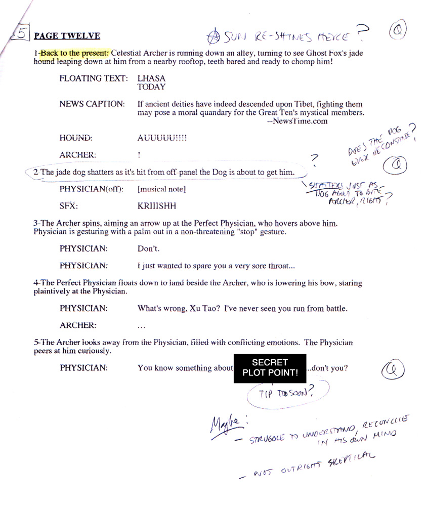
The steps taken to create Great Ten #2 Page 12!

This page was a lot of fun to work on, and I thought it would make a good example to share all the steps taken to create it!

I have found that this 4-step process works very well for me. I compare it to sculpting: I start with the most general, overall shapes and sizes, and progressively refine the detail in stages to arrive at the final image.

All the energy and work involved in each step is not wasted. Quite the contrary. By working on a lightbox, each step taken becomes the foundation for the next step. Nothing is wasted!

I also thought it helpful (for all those aspiring artists out there!) to show the relative sizes of each of the steps. Each comic page I create follows these same 4 steps - and each comic page I create begins with very small thumbnails!

Onto Step 1 !


Starting place: Script
STARTING PLACE: SCRIPT

Every page starts with a script! After all, the comic book artist is first and foremost a storyteller, so it is only proper to begin with the story!

We've all read a novel. When we become engrossed in the story, we lose track of the mechanical process of reading (eyes moving left-to-right, top-to-bottom) and images begin to take shape in our minds. Descriptive and clear text inspires sharp and clear pictures in our minds. In simple terms, that is the job of the comic book artist: to read the script, allow those images to form in our mind's eye, then scramble to get them down onto paper for further analysis and refinement.

Presented for your review is the script for this story page written by the excellent writer Tony Bedard. Read it over a few times, to make sure you understand the action occurring here. Just a few notes on my markings:

  • The boxed number in the upper left corner. That is simply the number of panels on the page. It helps to understand the density of images required by the page.
  • The pencil ovals and notes. A common occurrence for me - often each story page will have numerous notes in the margins! Whether a question, an inspiration for an idea, a clarification, etc., these notes are meant to sharpen my understanding of the story or immediate "initial reactions" to story points that should influence the art.
  • The Yellow highlights to indicate page composition information (like a notation that an image is a SPLASH, or a panel is an INSET, etc.)
  • I'll use Pink/Purple highlights to indicate REFERENCE items that need to be researched.
  • I'll use Orange highlights to indicate DESIGN items.
  • I'll use Green highlights to tag text that is to be integrated in the lineart (like text on a TV screen, or specific markings/signage on a building).

Normally, I read the entire script several times (at least 3 times) to make sure I understand the story, and to identify any opportunities to try something visually creative.

Furthermore, I usually do the bulk of the reference research and design work for the entire issue before drawing the first line! Each piece of missing reference or incomplete design creates a "gap" in the information needed to properly tell a story. I find that I work better if I close as many gaps as practical before drawing that first line.

So onto what I'll call STAGE 0 - the design work and reference gathering effort!


STEP 0 - DESIGN AND REFERENCE

Every page requires some level of design and reference. As the story unfolds, new characters and objects and locations are constantly presented, and the artist must be able to manage all these visual requirements.

In fact, I spent about 1 1/2 weeks just acquiring photographic reference and doing all the needed design work just for issue #2 !

DESIGN

Each complete story will feature objects never-before-seen, and it is the penciller's job to create the visual for these objects.

This particular page does not feature a character or object that hasn't already been designed.


Guard Lion

Lhasa
REFERENCE

Each story will feature real objects or locations that need to be portrayed accurately, and the artist must arm himself with sufficient photographic reference to enable articulation of those objects or locations. On just this one page we have Ghost Fox Killer's companion guard lion and the Tibetan streets of Lhasa.

At left you'll find samples of reference sheets I assemble for my working reference library. For issue #2 alone I created 67 similar reference sheets!


Step 1 - thumbnail sketches
STEP 1 - THUMBNAILS

Every single page I create begins as a set of small thumbnail sketches!

The point of the thumbnail image is to capture the large-scale information of the page:

  • Overall page composition (eye flow across the panels)
  • Selection of camera angles

That's it! Don't focus on the actual object details at this point - only on the ELEMENT PLACEMENTS and the RELATIONSHIPS BETWEEN ELEMENTS.

You can see I worked one main thumbnail here (note - I worked another alternate composition in the next stage!). Sometimes I "see" the written page clearly and I have a pretty solid idea of how I'd like the page to be designed with one good thumbnail. However, there are plenty of other times when I "see" a blizzard of competing ideas that have to be somehow distilled and analyzed. The thumbnail sketch is a very quick way to test / examine ideas to find the ones that work and the ones that don't.

I always begin page composition by trying to identify the strongest, most dramatic moment that occurs on the page. If one moment seems strongest, it becomes the dominant image on the page and all other images become subservient to it. Upon studying this page, I determined that panel 2 contained the most substantive and dramatic story beat on the page. Panel 2 would dominate the page, and panels 1,3,4,5 would be designed to complement it.

The question regarding panel 2 is to determine what camera angle works best: an angle that is nearly an over-the-shoulder shot from behind the guard lion, or an angle that is more perpendicular to the motion of the attacking lion (as indicated in the second thumb for panel 2. We'll check it out during the next stage!

The last consideration was the stacking arrangement of panels 3-5. The initial stacking is very geometric and symmetrical. Adjusting the panel sizes and utilizing a more staggered composition keeps the eye flow clear but adds a bit of energy to the composition.


Sketch A


Sketch B
STEP 2 - SKETCH

Once the thumbnail image is chosen, it is enlarged to the size shown above (which is nearly the size of the printed comic) and it becomes the foundation for this next sketch stage.

The point of the sketch stage is to begin to develop the structural detail underlying the drawing:

  • Capture the energy of fluid gestures and motions (of both objects and locations)
  • Rough in the perspective required to implement the shot
  • Develop the figures as cylinder bodies, capturing body language gestures, body line, figure balance and relative sizes throughout the shot
  • Accommodate sufficient space for all text (dialogue, captions and sound effects) required in each shot
  • Manage the proper flow of text WHILE maintaining proper storytelling rules.

At this stage the RELATIONSHIPS BETWEEN ELEMENTS are maintained and the elements themselves begin to take on the appropriate structures.

Sketch A:

    This sketch follows the thumbnail created in the prior step.

    The camera angle for panel 2 seemed to feel more naturally kinetic and dramatic by selecting the OTS camera angle (the flatter, perpendicular angle pushed the viewer away from the immediacy of the pending attack).

    Again, to give the page a sense of space and breath, I chose to give panel 2 an unusual border - it is only framed by a square of the alley's paving stones.

    At this point, I began to question whether flipping the camera POV's for panels 1 through 3 would create a more dramatic event. This is where Sketch B comes in!

Sketch B:

    This sketch provides a look at the page if the camera locations for panels 1-4 were reversed. Note that Panels 1-4, relative to each other, use alternating camera angles to give the sequence energy (repeating shots from the same camera angle tend to work well to highlight ONE element that changes in a sequence, and it tends to not work well during a very action-oriented sequence where lots of elements are changing).

    With this camera configuration, the main image, panel 2, seemed to put the Archer in the direct line of fire, and there would be lots of debris and detail that could clutter the effect (the shattering -but-still-recognizable guard lion, the flying shards, the super power effect, and the Archer himself.

    Comparing the two, I decided that the initial sketch A configuration was superior and would present a clearer, more controlled view of the action.

Last - managing dialogue.

    While not a concern on this page, the penciller MUST be able to manage the order of dialogue WHILE maintaining proper storytelling. You must block out the entire sequence, select the action axis and direction of travel, then work very hard to make sure the written order of dialogue can be clearly integrated with the line art. It is NOT professional to simply flip character positions or directions simply to accommodate a challenging order of dialogue! The art and text should fit together like a hand in a glove! But, again, this isn't a problem here on this page.

    Note that the Archer consistently moves forward L-to-R, and turns around to face the approaching Physician (who himself is moving into the action in the "forward" direction L-to-R).

    Also note that the action axis is defined between the Physician and the Archer. Thus, the camera moves back and forth ON THE SAME SIDE OF THIS AXIS, maintaining the relative position of the two characters.


Step 3 - layout
STEP 3 - LAYOUT

Here's the page layout, developed directly from the sketch completed in the previous step.

The point of the layout stage is to lock down enough structural and lighting detail to guide the full size rendering of the next (and last) stage:

  • Formalize the perspective, providing sufficient guide lines to interpolate at the next stage
  • Settle figure articulation
  • Rough in areas of light/shade, to ensure proper balance of positive and negative spaces (or to identify areas needing more clarity and separation).
  • Maintain sufficient space for all required text.

Perspective is an absolute necessity in visual storytelling, and it is far easier to manage vanishing points at a smaller scale than it is at full size. At the size of the layouts shown above, vp's commonly fall less than 24" from the image area. This distance is easy to reach on a drawing board with a handy ruler and extra paper taped to the layout. The vp's can be easily modified to find just the right distance to look "right" on the page.

NOTE - I have a rather large tutorial on perspective in the DRAWING COMICS section of the site! Check it out if you are interested in a more thorough discussion of the different perspective systems!

The layout now contains a great deal of design and structural information. The last thing left to do - apply the surface rendering!


Step 4 - finished pencils
STEP 4 - FINISHED PENCILS!

This is it - the very last thing to do is to apply the last touch of surface details to the work in progress! Many people think that the technical process of drawing - ie, pushing a pencil across the bristol board - is all we do! Actually, it's the LAST task in a long chain of design, choice and refinement!

The point of the finished pencil stage is to implement all the design, choice and refinement of the previous 3 steps:

  • Render as cleanly as possible the objects in the shot so the inker has the clearest idea of what you want.
  • Choose the detail to enhance / include, and choose the detail to reduce/ eliminate. Artistic license is needed to focus the reader's eye to the areas of interest in the shot, and to steer the reader's eye across the page.
  • Maintain sufficient positive and negative spaces, and a sufficient balance of light / shade.
  • Make sure the image is consistent and proper for your style - identify any lingering problem areas and correct them as best you can.


The finished product!
THE FINISHED PRODUCT!

The strong inking was provided by Andy Owens.

The stunning color art was rendered by Tanya and Rich Horie.